Understanding our Glazes
One of the most important elements of a Canterbury Pottery pot, is your choice of glaze. The combination of choice of colour and texture can have a huge effect on the resulting style of the finished piece. A mug glazed in Green with Brown Splashes, will have a rustic, earthy feel, compared to the same mug glazed in Sea Blue with Light Blue, which will have a cooler, timeless elegance, for example.
Each pot that we make is unique and the glazes can vary from firing to firing. The photographs are to give an impression of how the pots could look.
Richard has been developing his glazes for over forty years so there are a lot to choose from and it can be a confusing experience! Hopefully, the descriptions below will help answer any questions you may have, if not please feel free to contact us with your query.
-
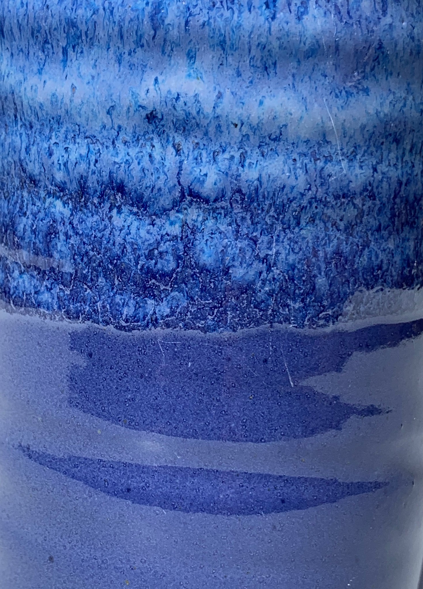
Cobalt Blue
A rich blue similar to Royal Blue. The top half of the pot will have flecks of lighter blue and white to add depth and interest. Shiny.
-

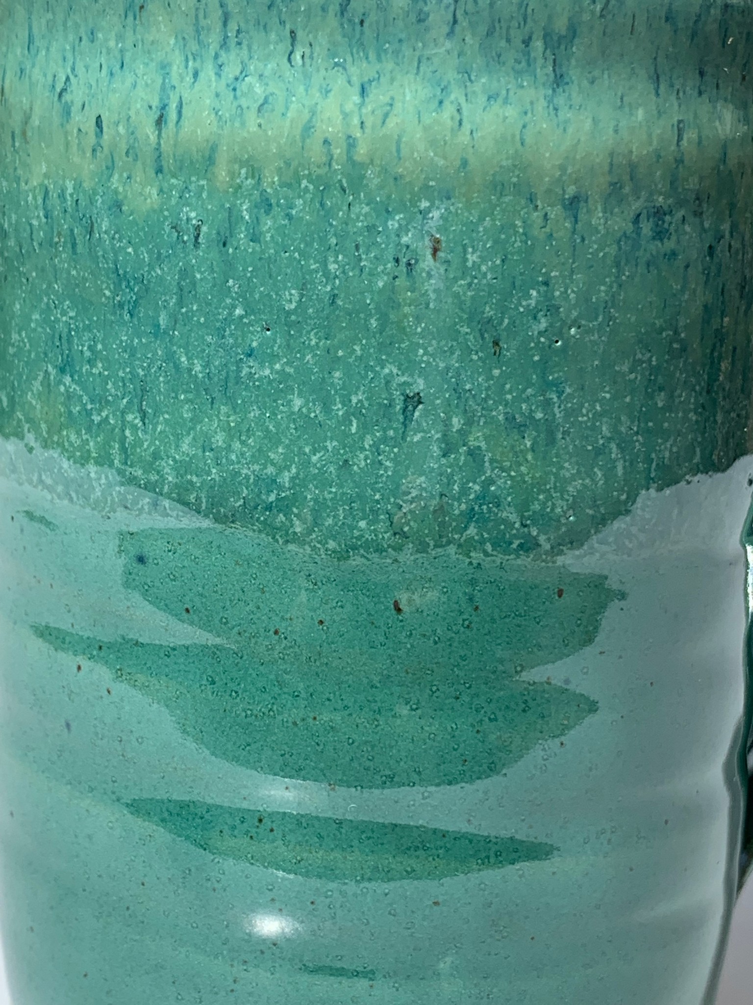
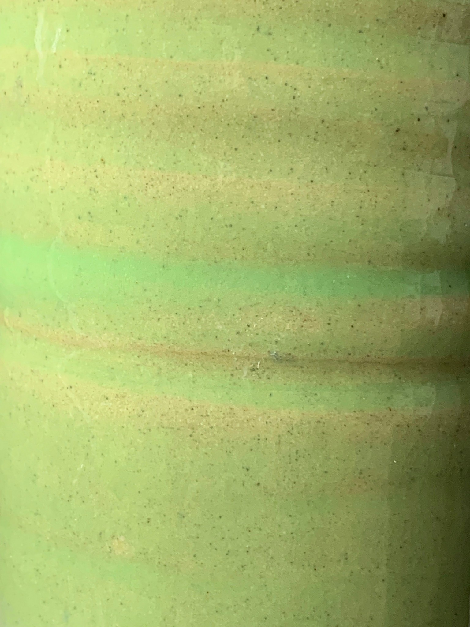
Green
A mid green colour similar to Jade. The top half of the pot will have flecks of lighter blue and lilac to add depth and interest. The Green glaze appears a deeper, grassier Green when combined with Brown Splashes. Shiny.
-
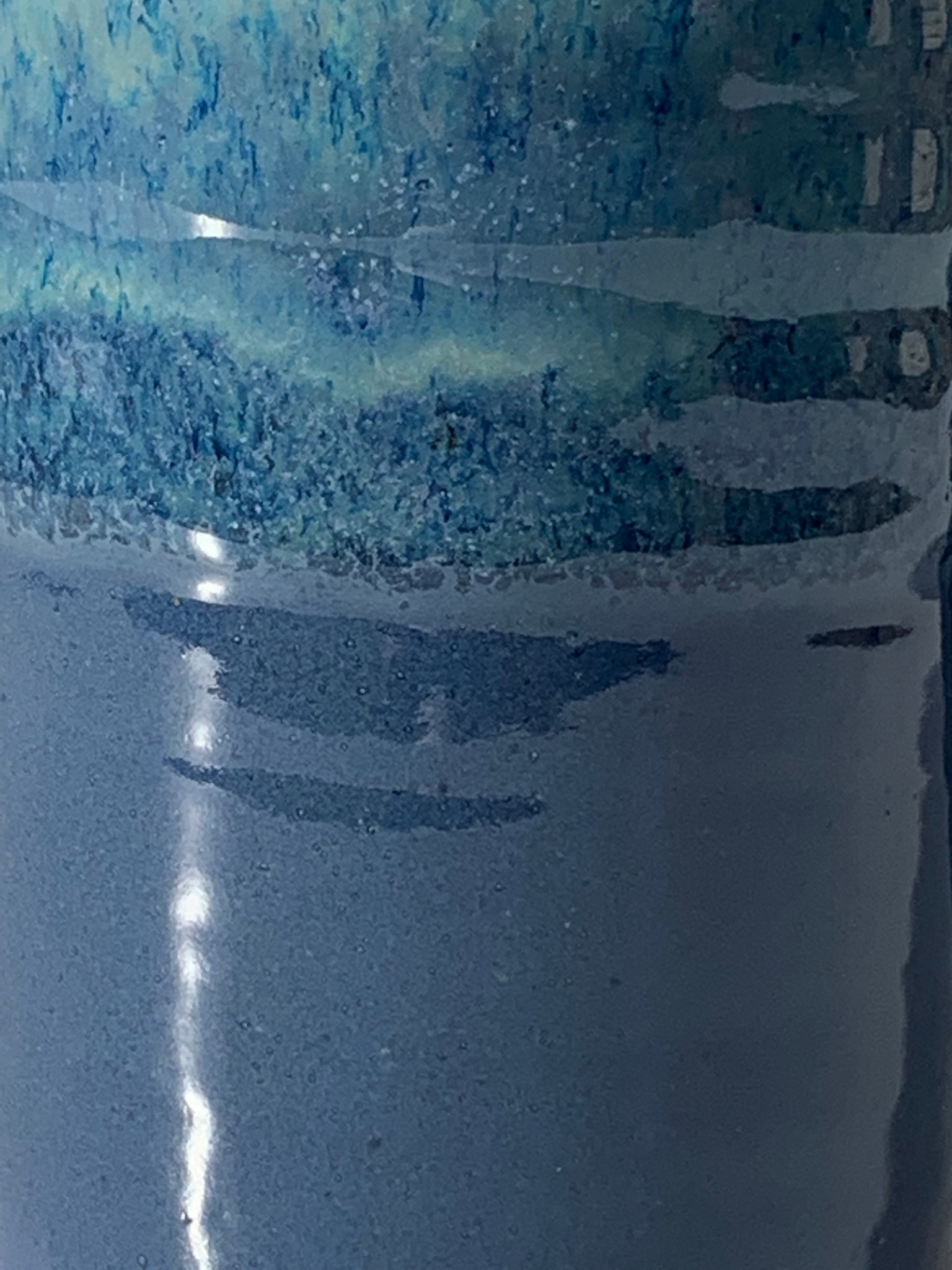
Sea Blue
Between blue and green, the colour is similar to Teal. The top half of the pot will have flecks of lighter blue and green to add depth and interest. A calm, sophisticated colour, it can be cool and subtle teamed with Light Blue or Light Oatmeal or warm and rich when combined with Brown Splashes. Shiny.
-
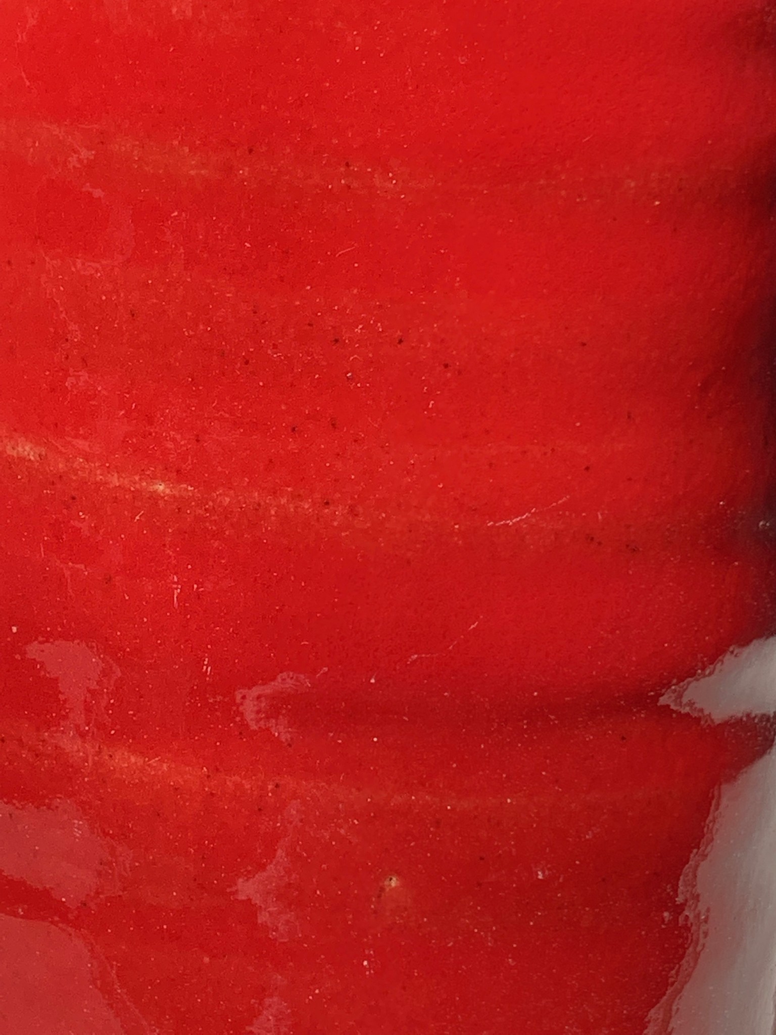
Venetian Red
On its own, Venetian Red is right in the centre of the red spectrum, so it is equally happy sitting with warm oranges and yellow, as cool blues and greens. When included in the ‘Splashes’ option, applied onto the Light Blue base colour, it becomes a vibrant raspberry pink. Semi-shiny. (Shiny in Splashes).
-
Light Blue
A pale sky blue, Light Blue glaze can vary from a silver white to a lilac colour, depending the firing. It is the base colour for all the Top Splashes glazes. Shiny.
-
Apple Green
A retro apple green colour, which works best teamed with Green, Sea Blue & Almost Black. Shiny.
-
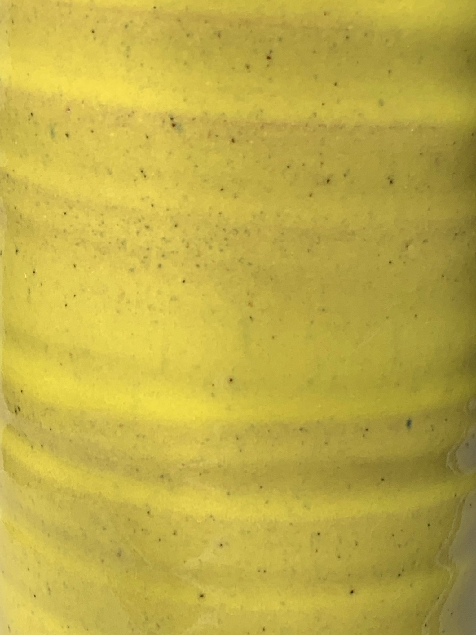
Yellow
A warm daffodil yellow glaze best teamed with Green. Shiny.
-
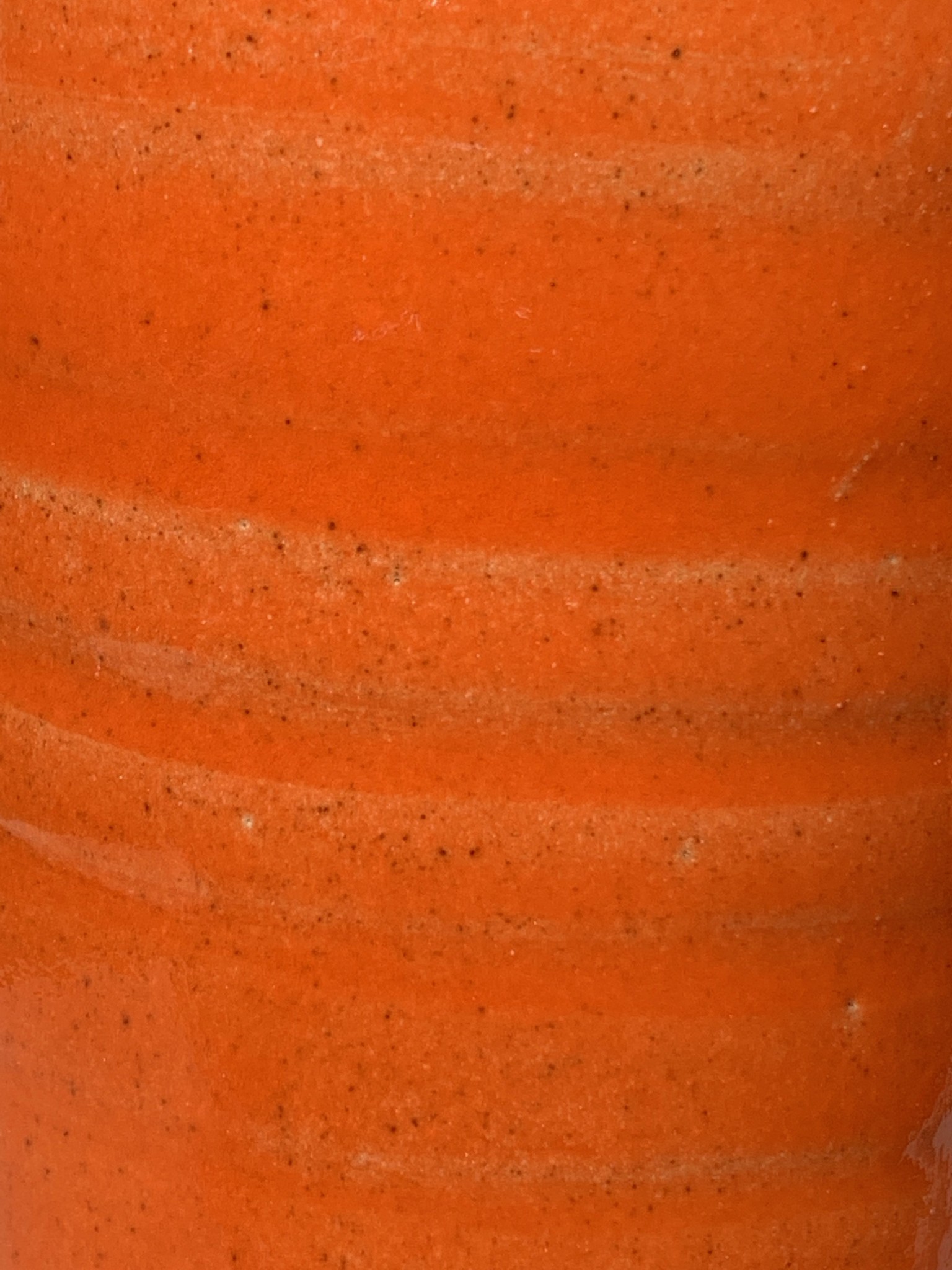
Satsuma
A warm, natural mid orange colour, best teamed with Green. Semi-Shiny.
-
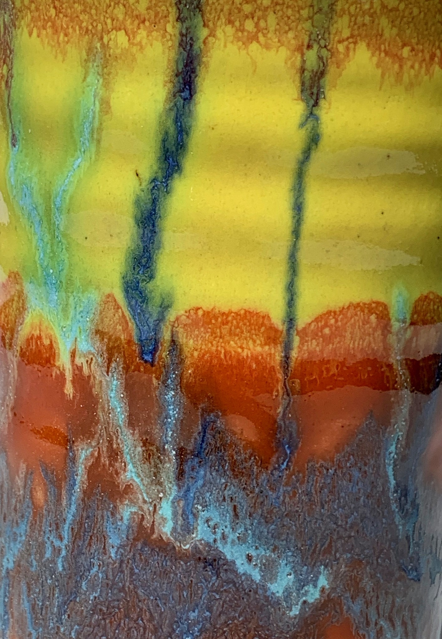
Tutti Frutti
An exciting mix of vibrant colours. A base top layer of Yellow, with a base bottom layer of Satsuma and then splashes of Green and Cobalt Blue. This glaze is not combined with other glazes. Shiny.
-
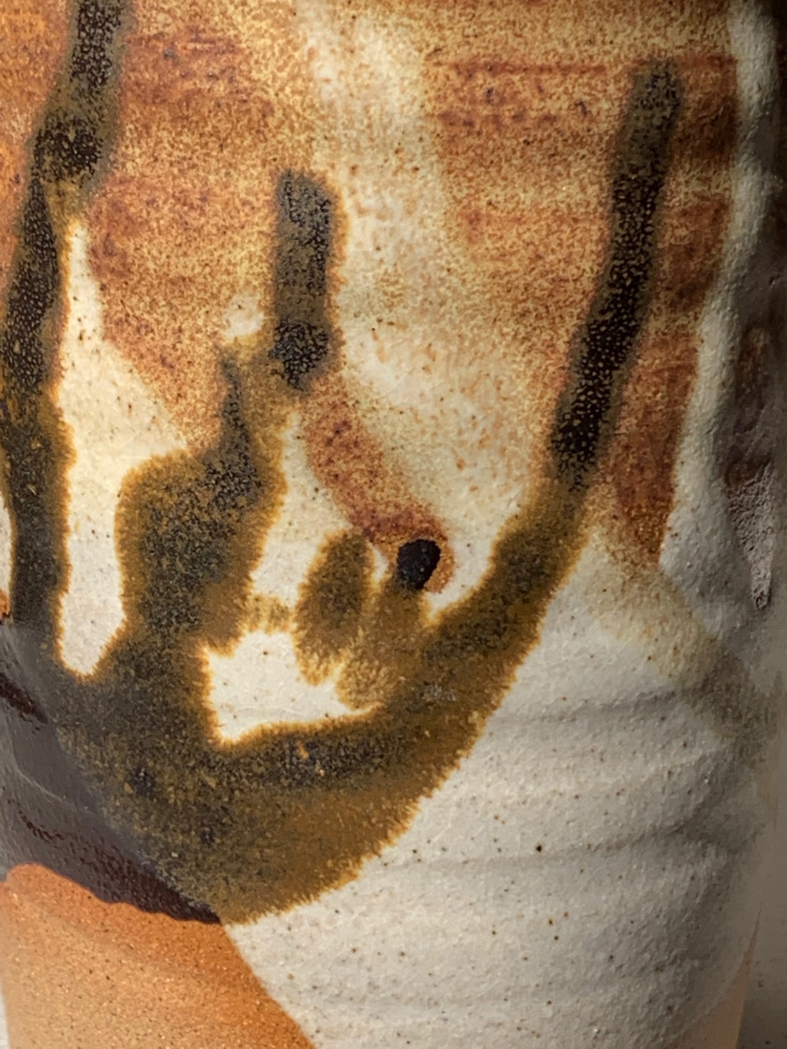
Brown Splashes
A combination of three brown matt and semi matt glazes, Almost Black, Light Oatmeal & Dark Oatmeal. The glazes are splashed on in a random pattern, leaving some areas unglazed. A warm, earthy effect which works particularly well with wooden furniture and floors.
-
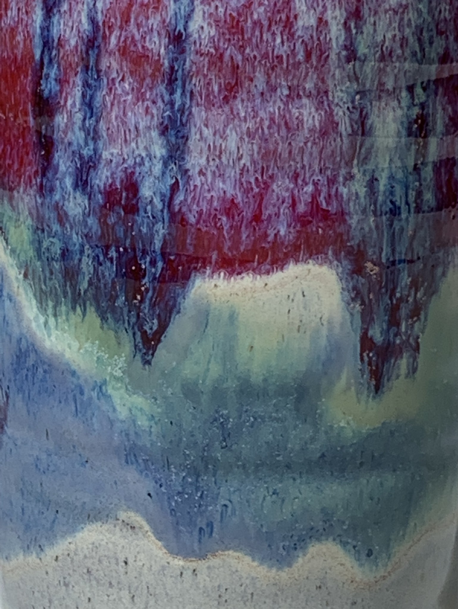
Top Splashes
Eg. Cobalt Blue Top Splashes, comprise of a base layer of Light Blue, which is
then splashed equally with Cobalt Blue, Green, & Venetian Red. Finally a top colour is added, which gives the piece its focal colour. Shiny. -
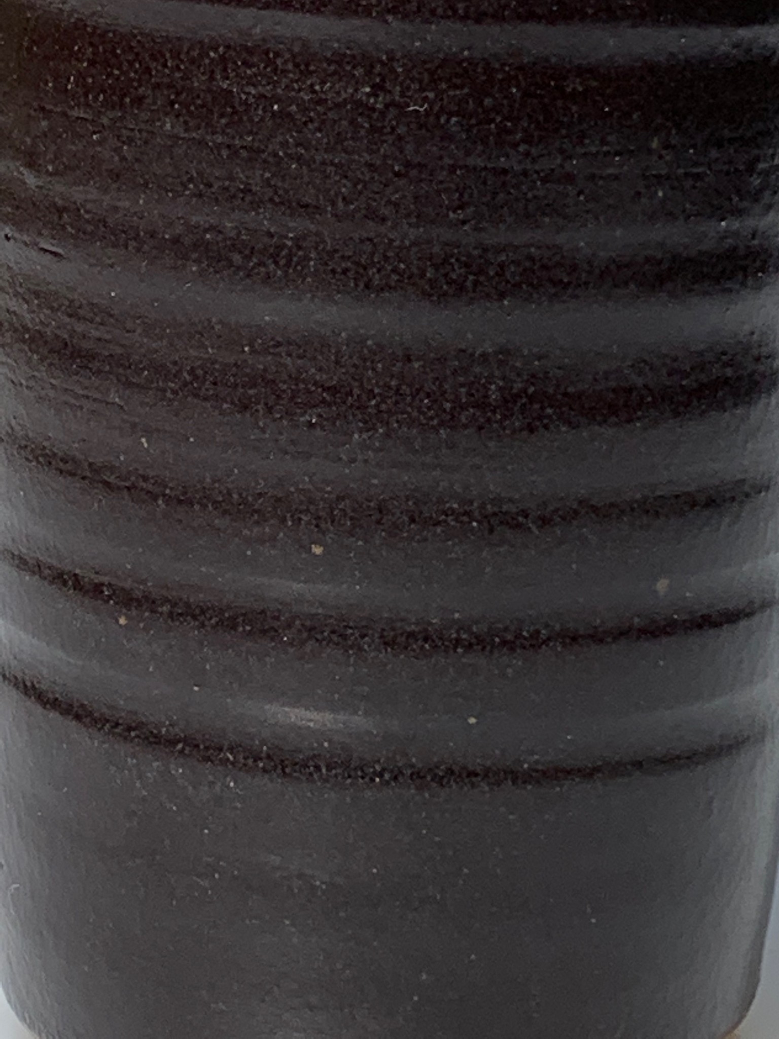
Almost Black
A very dark brown glaze, with a semi-matt finish. Used on top of Light Blue this becomes Slate.
-
Light Oatmeal
A flecked, pale stone colour. Popular when paired with a shiny top colour. Matt.
-
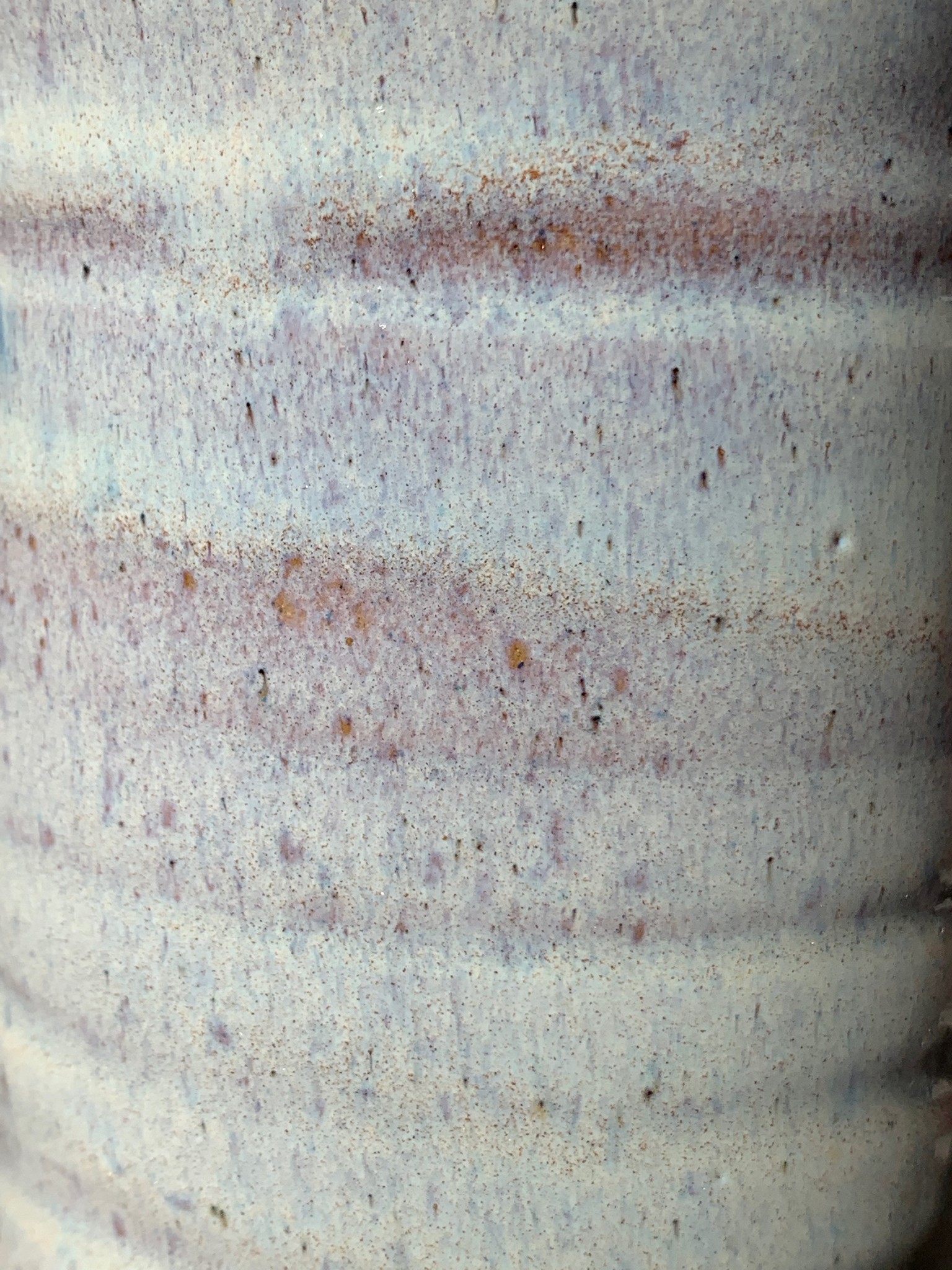
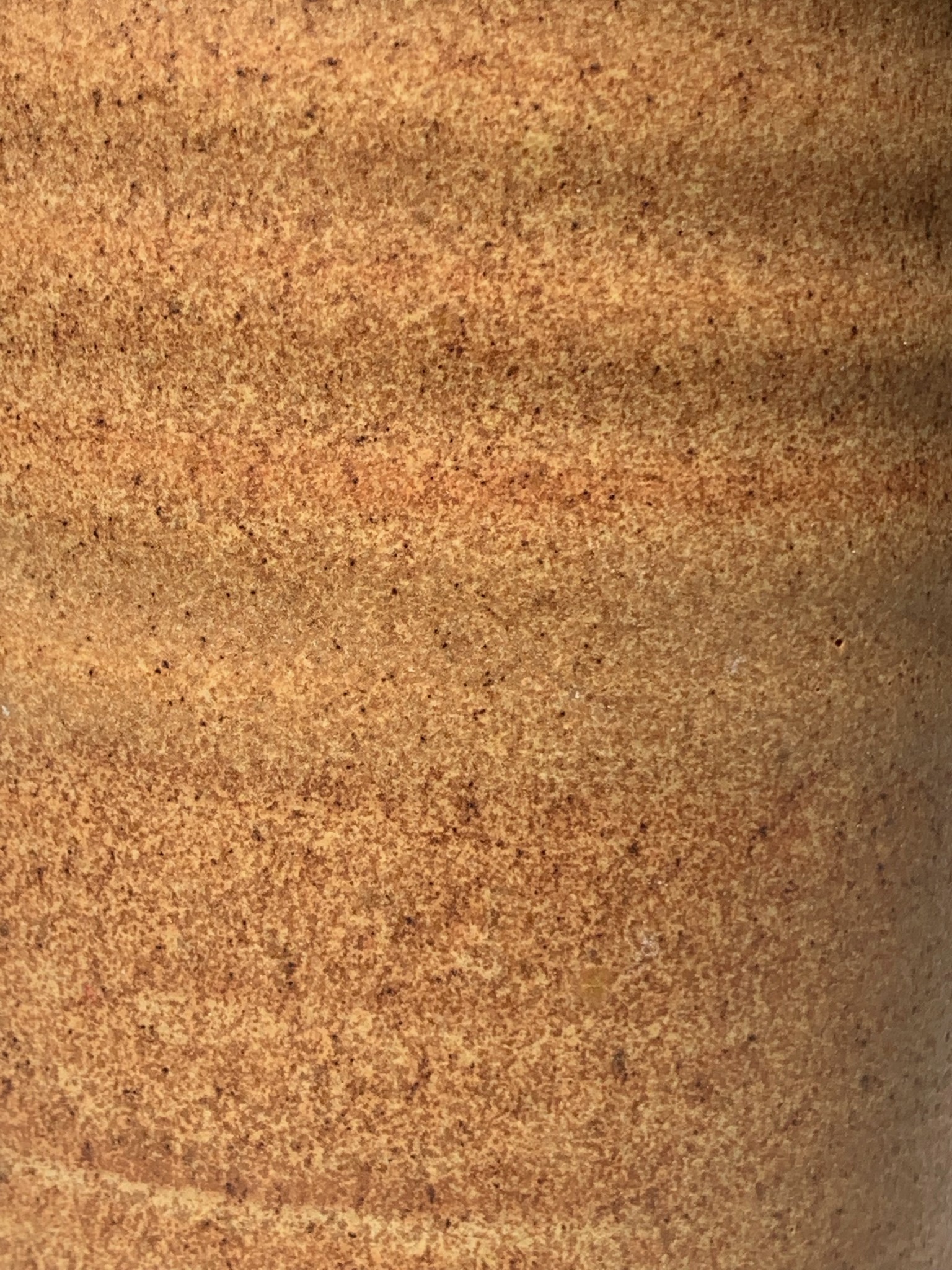
Dark Oatmeal
A warm biscuit colour, with tiny flecks of darker brown. Matt.
-
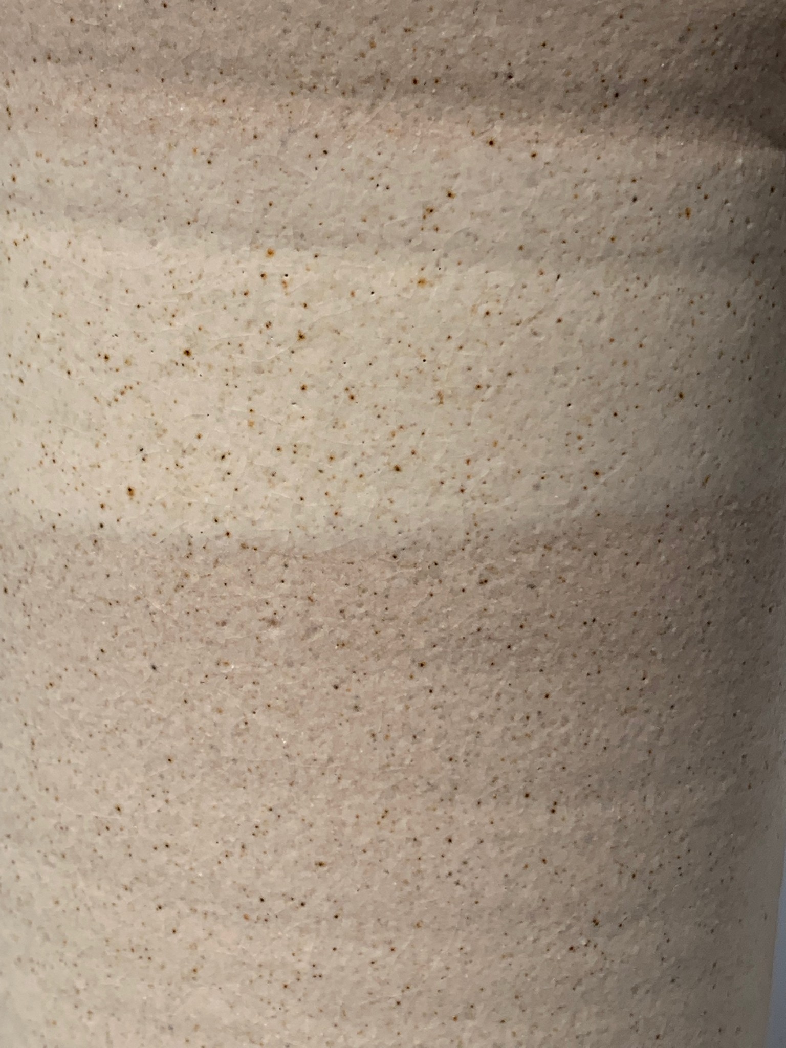
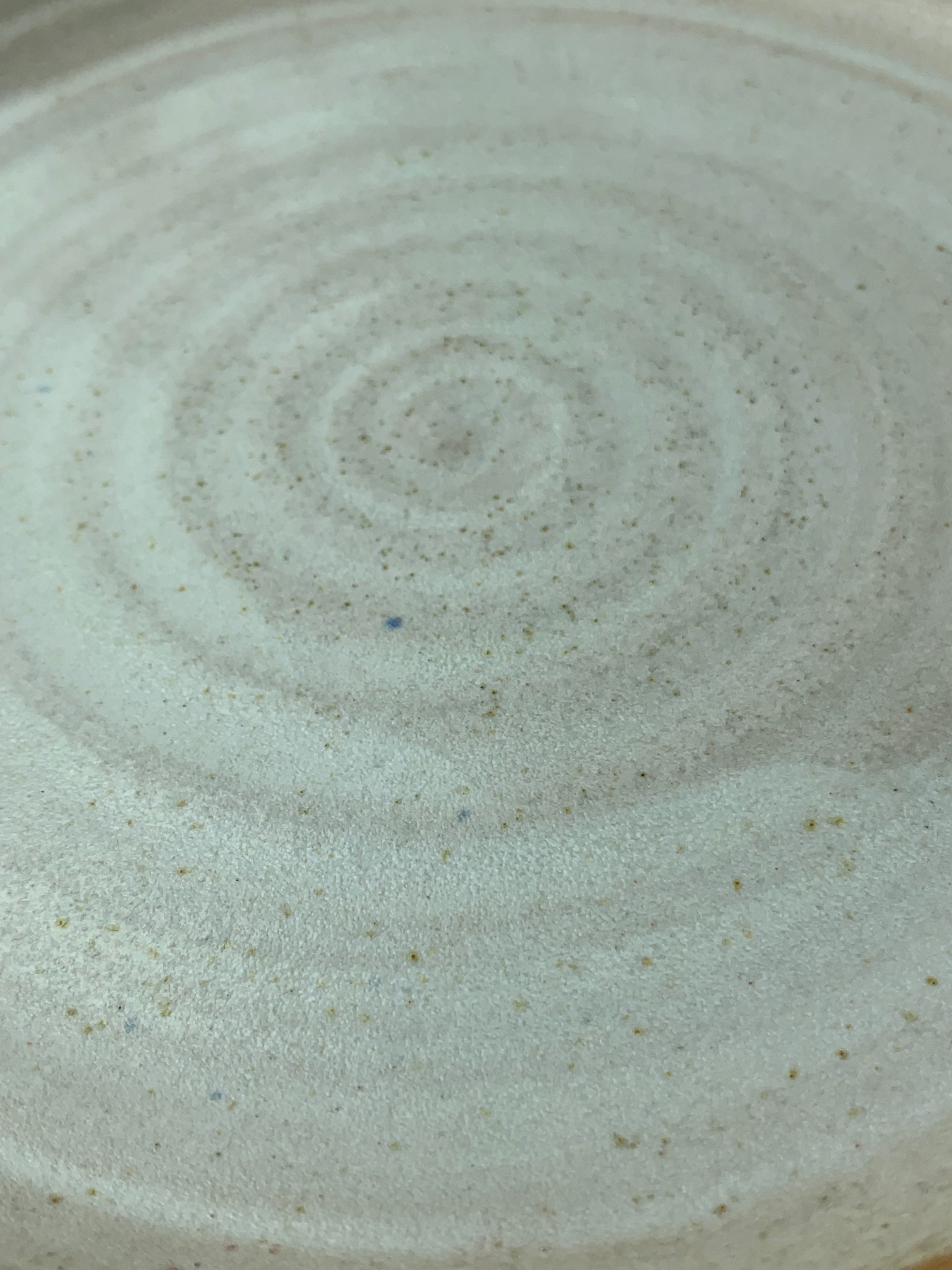
Fordwich White
A warm off-white colour, with very slight iridescent qualities and tiny flecks of golden brown and grey. A paler, more hard wearing version of Light Oatmeal.